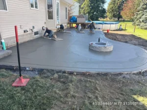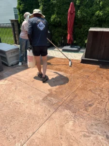
Most people decide they want stamped concrete before they have any idea what color or pattern they want. That is normal. You see a patio somewhere, it looks like slate or cobblestone, you find out it is poured concrete, and suddenly the project is on the table. Then someone hands you a color chart with sixty options and the whole thing stalls.
This is the guide we wish every homeowner had before that conversation. How the color actually gets into the concrete, which patterns we pour most often around Rochester, what combinations look right on the houses here, and how all of it holds up after a few winters.
How Stamped Concrete Actually Gets Its Color
There are three ways to put color into stamped concrete, and most finished jobs use two of them together. Knowing the difference is most of what you need to evaluate a quote.
Integral pigment
Pigment is mixed into the concrete in the truck, so the color goes all the way through the slab. The upside is that a chip or a scratch shows the same color underneath instead of a gray scar. The downside is that it produces a flat, uniform tone on its own. Integral color is the base layer, not the finished look.
Color hardener
Broadcast onto the surface and worked in while the concrete is still wet. It colors the top layer more intensely than integral pigment can, and it does something integral color does not: it hardens the surface, which matters anywhere that takes real foot traffic and furniture. Richer color and a tougher wearing surface in one step.
Release color
This is the one that makes stamped concrete look like anything other than colored concrete. A secondary color is applied right before the stamp is pressed in, partly to keep the mat from sticking and partly to settle into the low points of the texture. When the excess is washed off, the accent color stays in the grout lines and crevices and the high points stay lighter. That variation is what reads as natural material instead of a poured slab. A single color with no release almost always looks like exactly what it is.
The short version: integral or hardener sets the base, release creates the depth. If a quote only mentions one color, ask what the second one is.
The Stamp Patterns We Pour Most Around Rochester
A stamp pattern is a texture mat pressed into wet concrete. Every pattern below is named after the material it imitates, and every one of them is concrete when it cures.
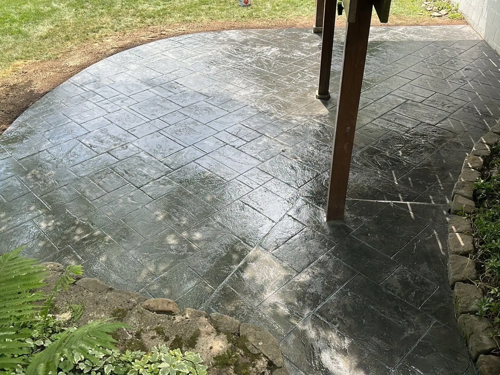
Ashlar slate
Rectangular cut-stone pattern in a repeating layout, mixing a few different unit sizes so it reads as fitted rather than tiled. The most requested pattern we install, and the safest choice if you are not sure. It reads as intentional and finished, it suits both traditional and newer homes, and it does not fight with whatever your siding is doing.
Flagstone
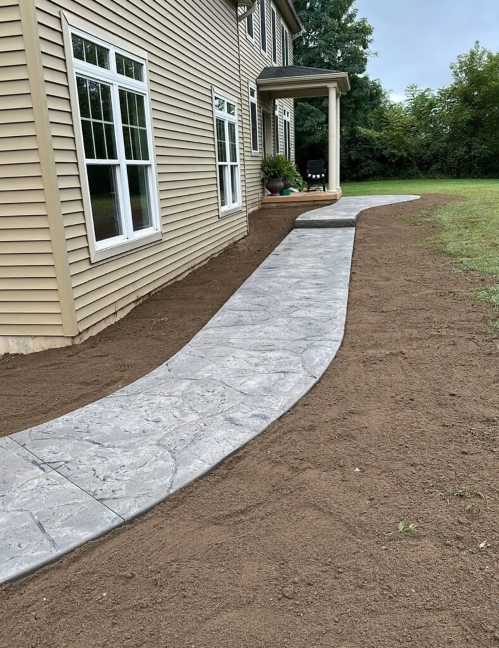
Irregular, organic shapes with wandering joint lines. Where ashlar looks cut, flagstone looks gathered. It works beautifully on a patio or walkway that is meant to feel like part of the yard rather than an extension of the house, and it hides minor surface variation better than a rigid geometric pattern does.
Cobblestone
Small rounded units in a fan or running-bond layout. It delivers old-world character without the settling and weed growth that come with real set cobbles, and it does its best work on entries and courtyard spaces where people arrive and slow down.
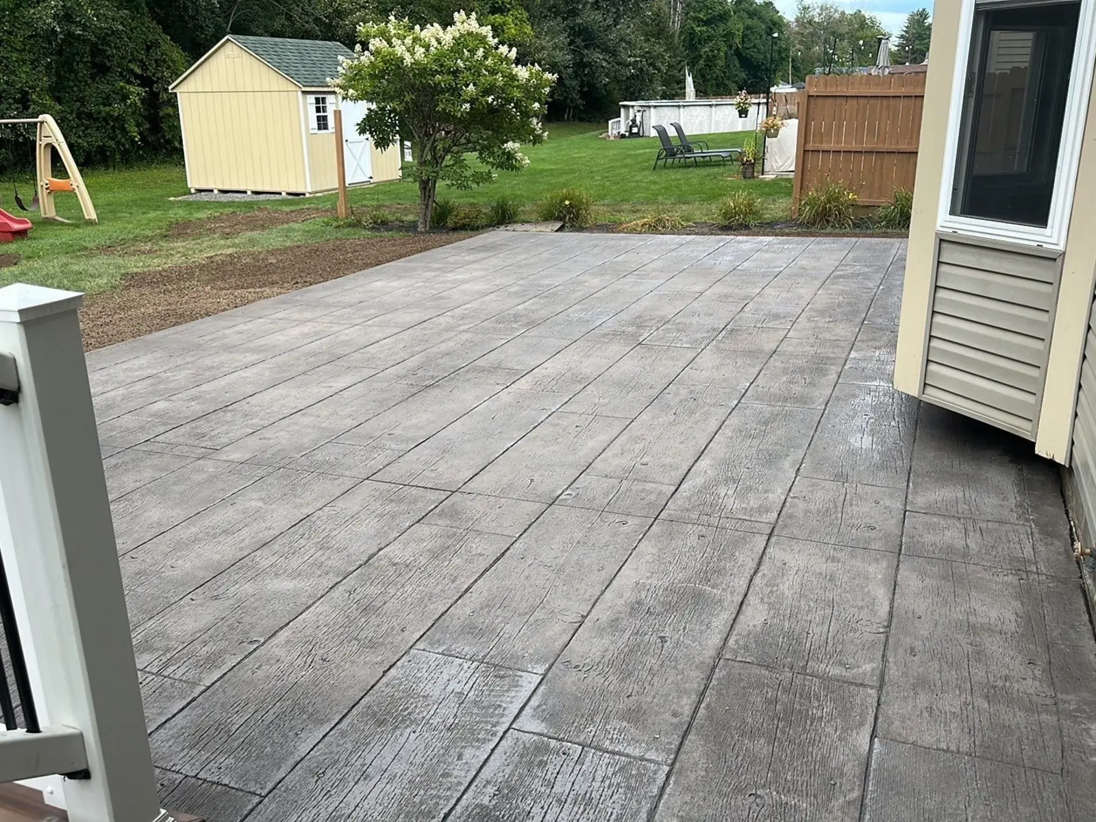
Wood plank
Board texture with grain and end joints, stamped to look like a deck surface. It has become popular for good reason: you get the look of wood on a surface that never needs staining and cannot rot. If you like the idea of a deck but the grade does not call for one, this is worth a look. If your yard actually does call for elevation, a real deck is the better answer and our deck builder page covers that side of it.
Brick
Running bond or herringbone. The natural pick when the house already has brick on it, because it echoes a material that is physically present rather than introducing a new one. Herringbone in particular photographs well on walkways and entries.
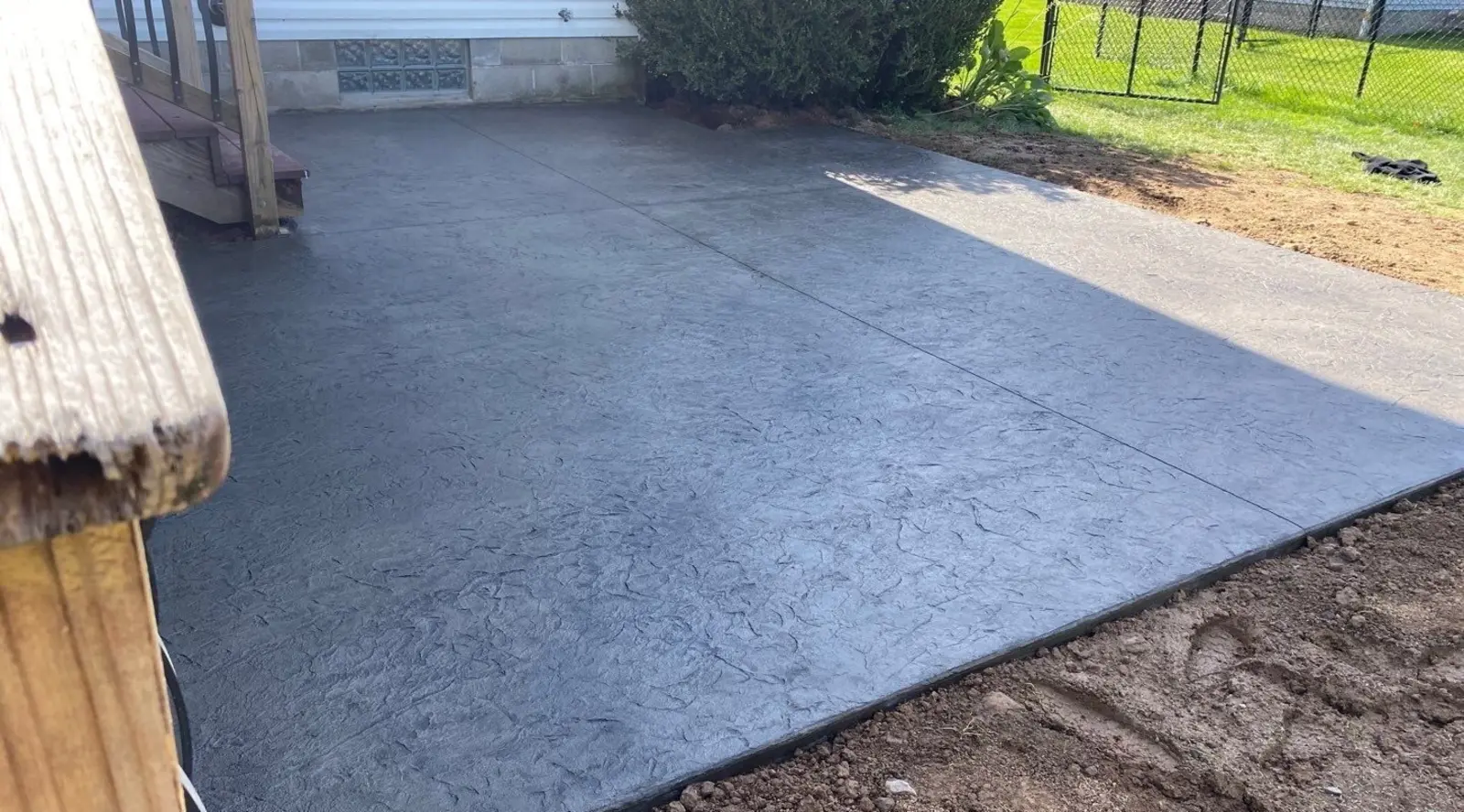
Seamless texture
No pattern at all, just texture. No joint lines, no repeating units, only a subtle surface variation that catches light. This is the quiet option, and it is the right one more often than people expect. On a modern house, a heavy cobblestone pattern can look costumed. Seamless texture with a good release color looks like a considered material choice.
Color Combinations That Work on Rochester Homes
Color advice written for Arizona does not survive here. Our light is different, our houses are different, and our patios spend five months next to dead grass and gray sky. These are the combinations that hold up locally.
Earth tones with a charcoal release
A warm tan or buff base with a dark charcoal release is the most reliable combination we pour. The warmth keeps it from going cold and institutional in winter, the charcoal gives the joint lines enough contrast to read from a distance, and it sits well against brick, stone-look siding, and almost any neutral. If you want one recommendation and no decisions, this is it.
Slate gray with a black release
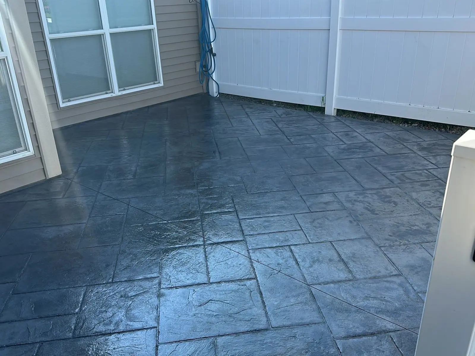
Cooler and more contemporary. Excellent on newer builds and on houses with gray or white siding and black trim, which is most of what has gone up around here in the last decade. The caution: gray on gray on a gray February afternoon can go flat, so it wants enough release contrast to hold structure in winter light.
Terracotta and brown
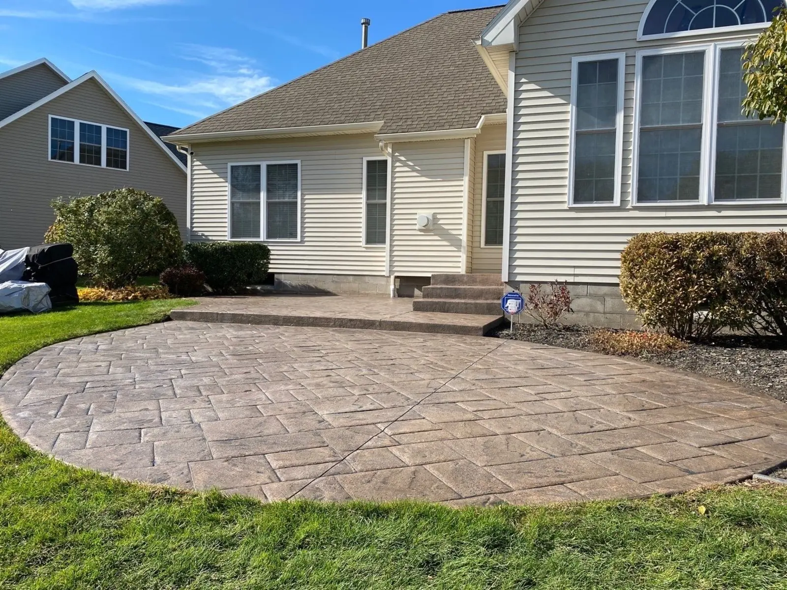
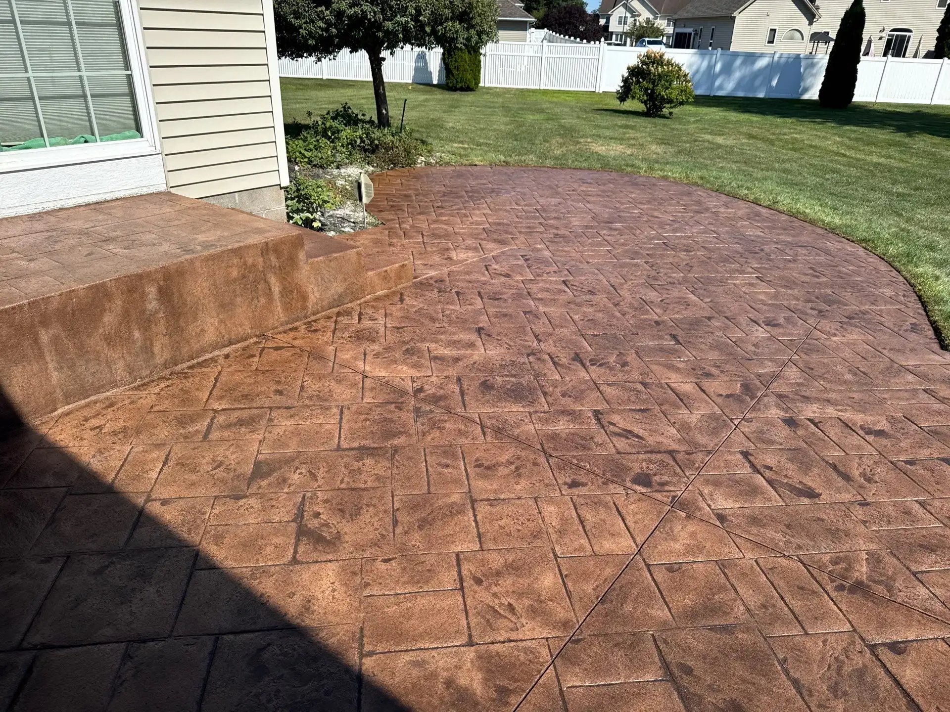
Warm red-brown tones, best on traditional homes and especially on anything with red brick already on it. Use restraint. Terracotta at full saturation across a large patio is a lot of patio. It works better as a base with a brown release pulling it back toward earth than as the loudest thing in the yard.
The rule underneath all of it
Pull from something already on the house. Roof shingles, brick, stone-look siding, window trim. A patio that picks up a color the house is already wearing looks like it was always meant to be there. A patio that introduces a brand new color looks added on, no matter how good the color is by itself. We will walk the exterior with you and pull from what is there, and we will say so if a color you like is going to fight the house.
Can You Pour Stamped Concrete Without Color?
You can, and it comes up more than you would think. Uncolored concrete with a stamp pattern gives you texture and joint lines in natural concrete gray.
We will pour it if that is what you want, but we will tell you what you are giving up first. Without a release color, the pattern loses most of its depth, because depth comes from color settling into the low points. What you get is a gray slab with grooves in it. On a seamless texture that can be a clean, deliberate look. On a cobblestone pattern it usually reads as unfinished.
If the motivation is budget, a better move is usually integral color with a release and a simpler pattern, rather than a complex pattern with no color at all. You keep the thing that makes stamped concrete look like stamped concrete.
How Color Holds Up Through a Rochester Winter
This is the part the national guides skip, and it is the part that decides whether you still like your patio in year eight.
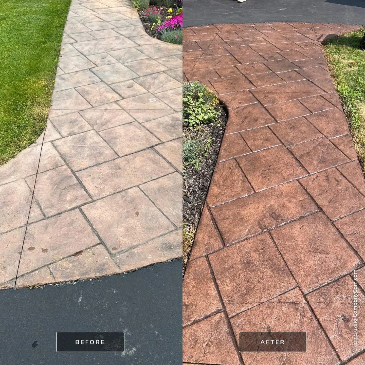
Color does not wash out of properly installed stamped concrete. What fades is the sealer, and a tired sealer makes good color look chalky and washed out. Sealer is the sacrificial layer, and around here it wants refreshing every two to three years depending on sun exposure and traffic. A south-facing driveway burns through sealer faster than a shaded patio does.
The bigger threat is what you throw at it in January. Rock salt is hard on concrete, and de-icers containing ammonium nitrate or ammonium sulfate are worse, because they attack the surface chemically rather than just aggravating freeze-thaw. Calcium magnesium acetate is the gentlest of the common options. On a sealed stamped surface, sand for traction is safer than any de-icer.
If you already have stamped concrete that has gone dull and faded, that is usually a sealer problem rather than a color problem, and it is fixable without replacing anything. Our concrete recoloring and resealing work exists for exactly that situation.
Where Color and Pattern Matter Most
The same pattern does different work depending on where it goes.
- Patios. Where most stamped concrete goes and where the color decision matters most, because you sit and look at it. Ashlar slate and flagstone dominate. See our concrete patio installation page for the build side.
- Walkways and entries. Scale down. A pattern sized for a 400 square foot patio looks cartoonish on a four foot path. Brick herringbone and smaller cobble hold their proportion, and an entry is where a pattern gets seen up close every day.
- Pool decks. Texture stops being decorative and starts being safety. Lighter colors also stay meaningfully cooler underfoot in August, which is not a small consideration on bare feet.
- Porches and steps. Often overlooked, and often the highest-visibility concrete on the property. A pattern that ties the porch to the walkway makes the whole front of the house read as one considered piece rather than three separate pours.
Frequently Asked Questions
How many colors can you use in one stamped concrete pour?
Two is standard and two is usually right: a base color and a release. Three is possible with a secondary release or an accent band, and occasionally it is worth it on a large patio with a border. Past that you are usually adding complexity rather than beauty. The variation that makes stamped concrete look natural comes from how the release settles into the texture, not from the number of colors on the invoice.
Will my stamped concrete color fade over time?
The color itself does not fade in properly installed stamped concrete, because integral pigment runs through the slab and color hardener is worked into the surface. What fades is the sealer on top, and that reads as fading. Refreshing the sealer every two to three years in Rochester brings the color back. Long-term dullness is almost always a sealer maintenance question, not a concrete failure.
Can you match stamped concrete color to my existing patio or house?
Usually, yes, and it is part of the conversation before we pour. We can pigment to a target color family and adjust the release to move the finished tone warmer or cooler. Exact matching to an existing older slab is harder than people expect, because concrete changes tone as it ages and weathers. We aim for a deliberate complement rather than a match that will drift, and we will be honest with you about which one is realistic on your site.
Which stamped concrete pattern is best for a Rochester patio?
Ashlar slate is the one we recommend most, and it is the safest answer if you are undecided. It reads as finished and intentional, it suits both older Rochester homes and newer builds, and it does not compete with whatever the house is already doing. Flagstone is the better pick if you want the patio to feel like part of the yard rather than an extension of the house. The more important decision is not the pattern but the build: correct base preparation, correct thickness, and proper curing. Pattern is the part you see, and the rest is the part that decides whether you still like it in ten years. Our stamped concrete contractor page walks through the full process.
Still Deciding?
Nobody picks stamped concrete colors well off a chart. Color reads differently at full scale, in your light, next to your house, than it does on a four inch sample. We bring samples out, hold them against the exterior, and talk through what the pattern will look like at the size of your actual space.
If you are weighing stamped concrete against pavers before you get to color at all, our stamped concrete vs pavers comparison covers cost, maintenance, and durability side by side. And if you already know stamped is the direction, the stamped concrete page covers process, cost, and timeline for the Rochester area.
Estimates are free, and we would rather spend twenty minutes helping you get the color right than have you look at the wrong one for the next twenty years.